

47.3K people follow this city
Full screen


Contributors
8
Stations
10
Contributors category
1
Government
0
Non-profit organization
0
Educational
0
Corporate
1
Individual
6
Anonymous
Most polluted air quality stations
| # | station | US AQI |
|---|---|---|
| 1 | Dallas Victory Park 2323 N Houston St | 37 |
| 2 | Dallas Hinton St. C401/C161 [E] | 36 |
| 3 | Dallas Downtown Historic District | 33 |
| 4 | Kilmichael Lane - PAII | 27 |
| 5 | Dallas North C63 | 26 |
| 6 | Dallas Redbird Airport C402 | 22 |
| 7 | Cedar Crest | 18 |
| 8 | Royalshire Drive | 16 |
| 9 | Bent Creek Trl | 10 |
| 10 | Meadow Glen | 9 |
Health Recommendations
 | Enjoy outdoor activities |
 | Open your windows to bring clean, fresh air indoors GET A MONITOR |
community highlight
Dallas most followed contributors

Become a contributor
Get an AirVisual Outdoor and contribute to collecting millions of data points for the Dallas map to track local air pollution
News
The latest air quality news and resources.


Understand air pollution and protect yourself
Dallas MAP AIR QUALITY ANALYSIS AND STATISTICS
What levels of air pollution are shown on the air quality maps in Dallas?
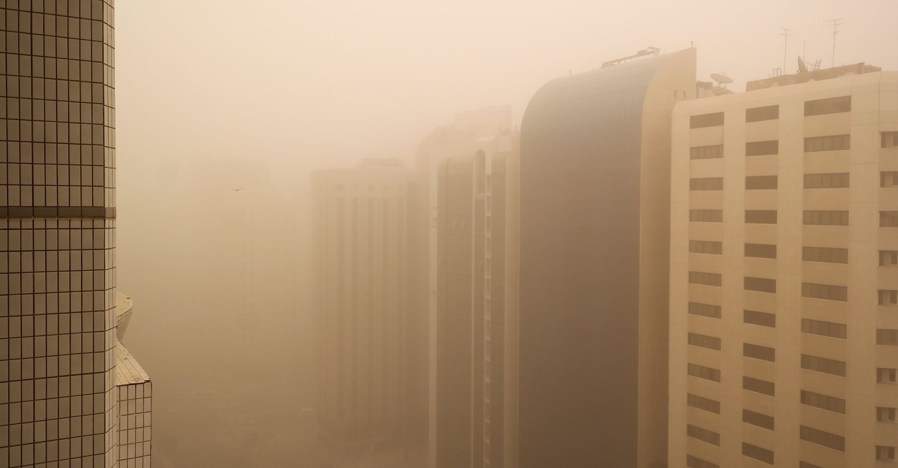
The air quality map, or air pollution map as it can also be referred to, shows many different pollution readings across Dallas and surrounding areas in the form of US AQI readings, shown on numerous colored discs across the map above. The color codes of these discs pertain to the pollution levels, with brighter colors such as green (indicating a 'good' level of air quality) letting users know instantly that air pollution levels are low, whilst darker colors such as red, purple and maroon all indicate more severe levels of pollution present. Whilst these will rarely be seen within many cities throughout America, there may be rare occasions when certain areas will see such large elevations due to an air quality monitoring station being in close proximity to a fire, thus receiving the full amount of its smoke, which drives the pollution reading up rapidly to dangerous levels.
As was mentioned, Dallas maintains a good air quality level in many areas across its air quality map for much of the year, although these can change very rapidly, hence the need to check for how polluted certain areas are. To quote some US AQI figures taken in the late days of May 2022, readings in Dallas presented at 12, 13, 30 and a high of 34, all falling within the 'good' classification bracket (which requires a US AQI reading of 0 to 50). This indicated that during the month of May, Dallas had an optimal level of air cleanliness, with the figures that are closest to 0 showing the cleanest areas of the city.
Can air quality maps help prevent health issues for people in Dallas?
Those with pre-existing health conditions (as well as other at-risk people who will be discussed at greater length in the next question) will benefit significantly from viewing the US AQI readings on the air quality map. Health problems such as chronic obstructive pulmonary disease (COPD) can be avoided, particularly for those who suffer from ones such as asthma or bronchitis, whereby clouds of polluted air can have dangerous consequences. In closing, air quality maps in Dallas can significantly reduce the number of health issues amongst inhabitants, if used correctly and more importantly at times when the air pollution level might be on the rise.
Which people can benefit the most from using air pollution maps in Dallas?
As was touched on briefly earlier in the article, all citizens within Dallas can indeed benefit from the aid of using the air quality map as presented above, along with keeping tabs on the Dallas city page (which can show forecasts, pollution level concentrations, as well as showing averages taken over previous years, available on the historic air quality data pages) and the AirVisual app that shows air cleanliness levels, or lack thereof, from the user's device which enables on the go monitoring of air pollution levels throughout the city. Whilst all members of society, and those passing through for work or holidays, will indeed benefit from knowing which areas are the most polluted and avoiding them, there are also certain demographics of people that will find such information considerably more useful, particularly that found on the air quality map as it shows exactly which areas of Dallas have the highest levels of pollution and at what times. Constant monitoring of air pollution levels for certain individuals can also help gain insight into which times of the day are the most polluted, and which areas have the most consistently high US AQI readings (with the pollutants that go into forming the US AQI level being discussed in the following question), as well as which months are prone to showing patterns of elevated pollution levels, with smoke, haze, car fumes and clouds of ultrafine particles potentially being in the atmosphere in certain areas, as indicated by elevated readings on the air quality map, and the city page (shown as an average reading over the whole city).
Referring back to those that will benefit the most from close monitoring of the US AQI readings and thus how clean the air is, those who are in poorer health, have pre-existing health conditions, or those prone to illness due to a number of reasons will all of course benefit. The other key demographics that will find using air pollution maps highly useful are groups such as the elderly, who can be prone to conditions that affect their respiratory tract, lungs and heart. By checking the air quality map for Dallas, elderly citizens, particularly those who have weaker chests or other comorbidities that make them susceptible to pollution-related illnesses, can avoid areas that have higher levels of pollution, as well as see which way the wind is blowing, or whether there are any fires taking place within a certain radius. Wind direction and external high pollution events (such as fires, which can cause some of the most prominent spikes in US AQI levels to be seen on the air quality maps to take place) are all important as they may indicate the spread of pollution out from one particular area, as the wind has a potent impact on moving air pollution away (which can be both positive and negative, as in that it is highly effective in removing pollutants from the atmosphere in a given place, but negative because it may blow it directly over other inhabited areas, causing potential spikes to be seen on the air quality map above).
Other people or groups that will benefit from avoiding polluted areas via the use of air quality maps and other similar means include young children, babies, and pregnant mothers. During the vital developmental stages taking place during the early years, certain chemicals and ultrafine particles can have a highly negative effect, causing stunted mental and physical growth amongst young ones, as well as potential side effects to the unborn children being carried by pregnant mothers. As such, families who are expecting or have younger children can utilize the air quality maps to their full extent, keeping the younger family members safe and expectant mothers healthy (pollution exposure during the pregnancy period can result in potentially lower birth weight, premature delivery, as well as raising the overall infant mortality rate, making avoiding more highly polluted levels as shown on the air quality maps a must for these groups).
What can the readings on the air quality maps tell us about pollution in Dallas?
Readings shown on the air quality map for Dallas are presented in the form of US AQI, which is a figure aggregated from several main pollutants present in the air. The total concentration of these pollutants is calculated to give you the US AQI figures seen above, and amongst these pollutants are ones such as nitrogen dioxide, ozone, carbon monoxide, and sulfur dioxide, as well as the two forms of particulate matter, PM10 and PM2.5, with the latter being far more dangerous, and potentially one of the most dangerous forms of pollution in the air, depending on the material it consists of. Higher US AQI readings indicate higher levels of these pollutants being present, and as such, referring to the air quality map for Dallas can show users that they may be in contact with such pollutants, and can thus make better attempts to avoid them, or take preventative measures such as wearing ultrafine particle filtering masks, with higher quality ones being available on the IQAir website.
Dallas air quality data attribution
8Contributors
Government Contributor
 David Dowse
1 station
Individual Contributor
 6 Anonymous contributors
6 stations
6 Anonymous Contributors
4 Data sources
 Data validated and calibrated by IQAir
Where is the cleanest air quality in Dallas?
Stay Informed. Download #1 air quality app
Air pollution forecast, pollution alerts and much more to help you plan your days and keep protected against air pollution


